
*Analysis of Chunky Monkey: An Original Typeface
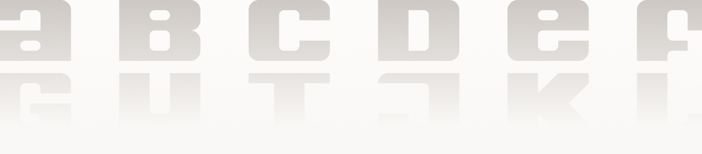
Chunky Monkey is an original, hand-drawn typeface that was digitally constructed with FontStruct software. Type Specimen spreads were designed to showcase how it can be used, illustrate the anatomy of the typeface, and provide a scale reference to highlight its capabilities.
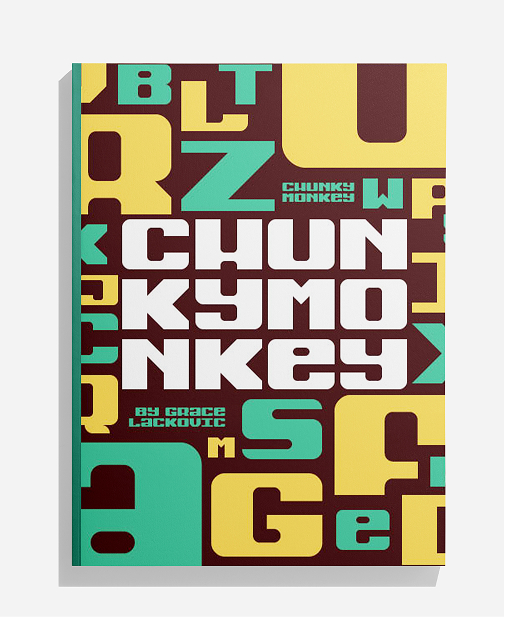
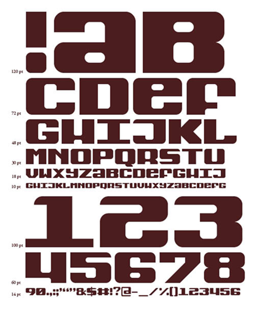
The successful construction of Chunky Monkey was entirely dependent on the sketching process in the beginning stages of the project. After many iterations and brainstorming sessions, initial sketches using a 6x8 grid finalized the overall structure of each letterform, number, and punctuation.
This analysis encompasses the following stage of the process which involved more grid-based sketching to fine-tune each letterform, determine the defining characteristics of the typeface as a whole, and ensure the unique qualities of Chunky Monkey were consistently applied to each character to create a cohesive whole.
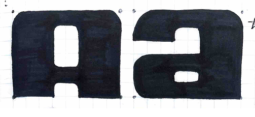
Some of the most enjoyable challenges resulted from my interest in Chunky Monkey being mixed-case. For the letter A, the first sketch seemed like the obvious choice, but as more of the typeface was drawn, an alternate, lower-case A was introduced that better embodies the playful quality of Chunky Monkey. The letter A is such a defining part of a typeface, so the lowercase offered more opportunities for contrasting round and hard corners.
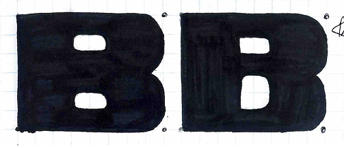
The B posed the first big decision regarding the sizing and positioning of bowls. It was determined that the bowl/counter sizes would be 1x2 and 2x2 and would then be applied consistently across all letterforms. These proportions maintain the chunky, slab quality of the typeface while bracketing the bowls and counters provides a soft, sculpted feeling.
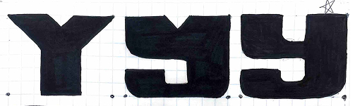
The most important part about decisions like the ones that were made for the letter Y was to ensure that each letterform felt like it belonged to the same typeface with consistent form and styling. The decision was made to incorporate more lowercase characters, which was extremely successful for the Y. Bracketing several of the corners and counters made it feel more sculpted and playful while also balancing the positived and negative space.
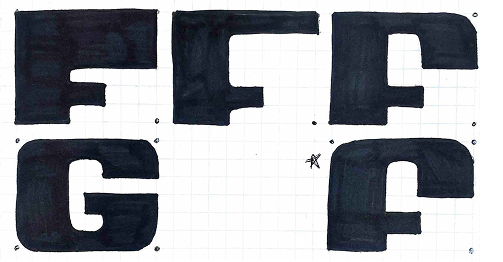
Some letters required much more experimentation than others. Sketches for the letter F first focused on the overall structure of the stem and arms in regards to weight and proportions on the grid. The upper half of the letter was informed by and mimics the construction of several others in Chunky Monkey, such as B, E, P, and R. This adds to the cohesiveness of the typeface. The final decision was made to round both corners at the top of the F and bracket the upper portions of the counter to create a soft, molded structure.
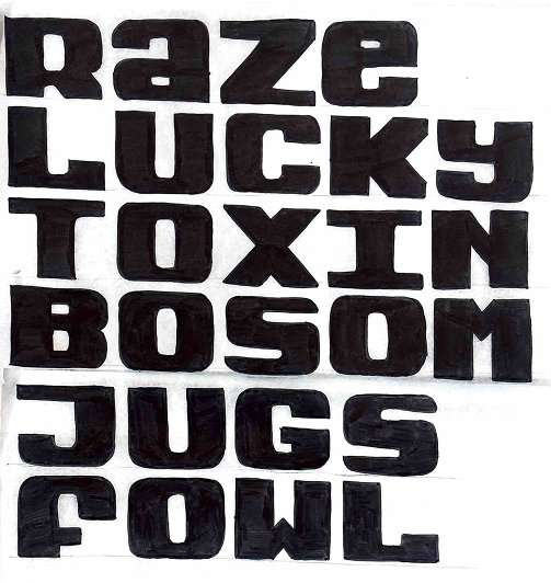
As final sketches were being made, word tests were conducted to ensure that Chunky Monkey functioned as a cohesive whole. This also helped to determine that all letters were balanced in terms of positive and negative space and to consider default spacing of the typeface, such as kerning, tracking, and leading.

